Complete Posts configuration: fields, list styles, post metadata layouts, OG image handling, frontmatter examples, markdown syntax, and expressive-code config.
The following files are compatible with this document:
src/pages/posts/[...id].astro- post specific content display page.src/pages/posts/[...page].astro- post list page.src/content/posts- posts collectionsrc/content.config.ts- posts dataset and frontmatter configuration.ec.config.mjs- expressiveCode config.plugins/index.ts- remark and rehype plugins.src/config.ts- posts page config.src/components/posts- most of the components come from here.
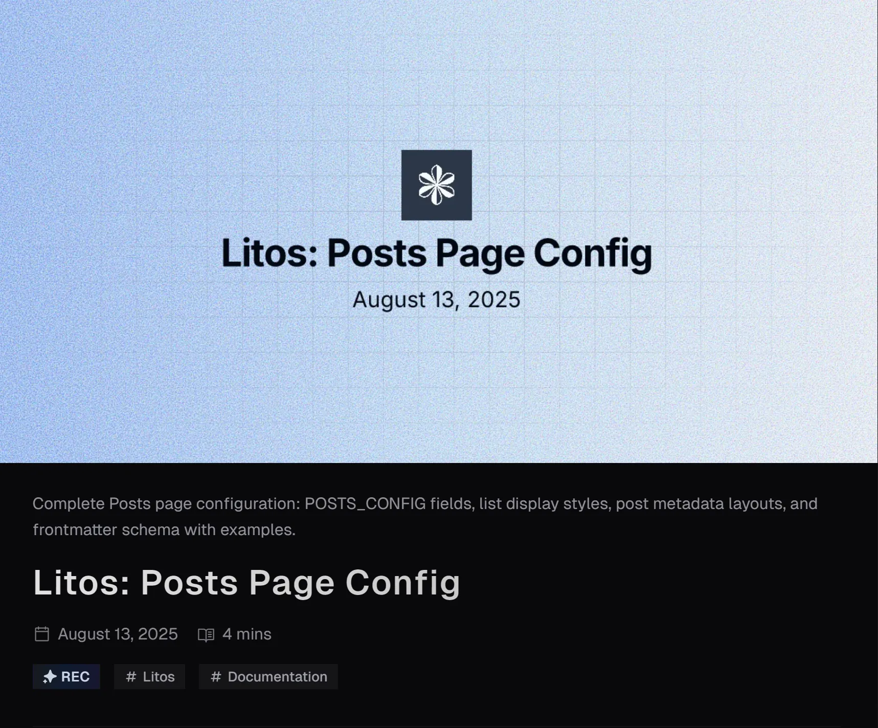
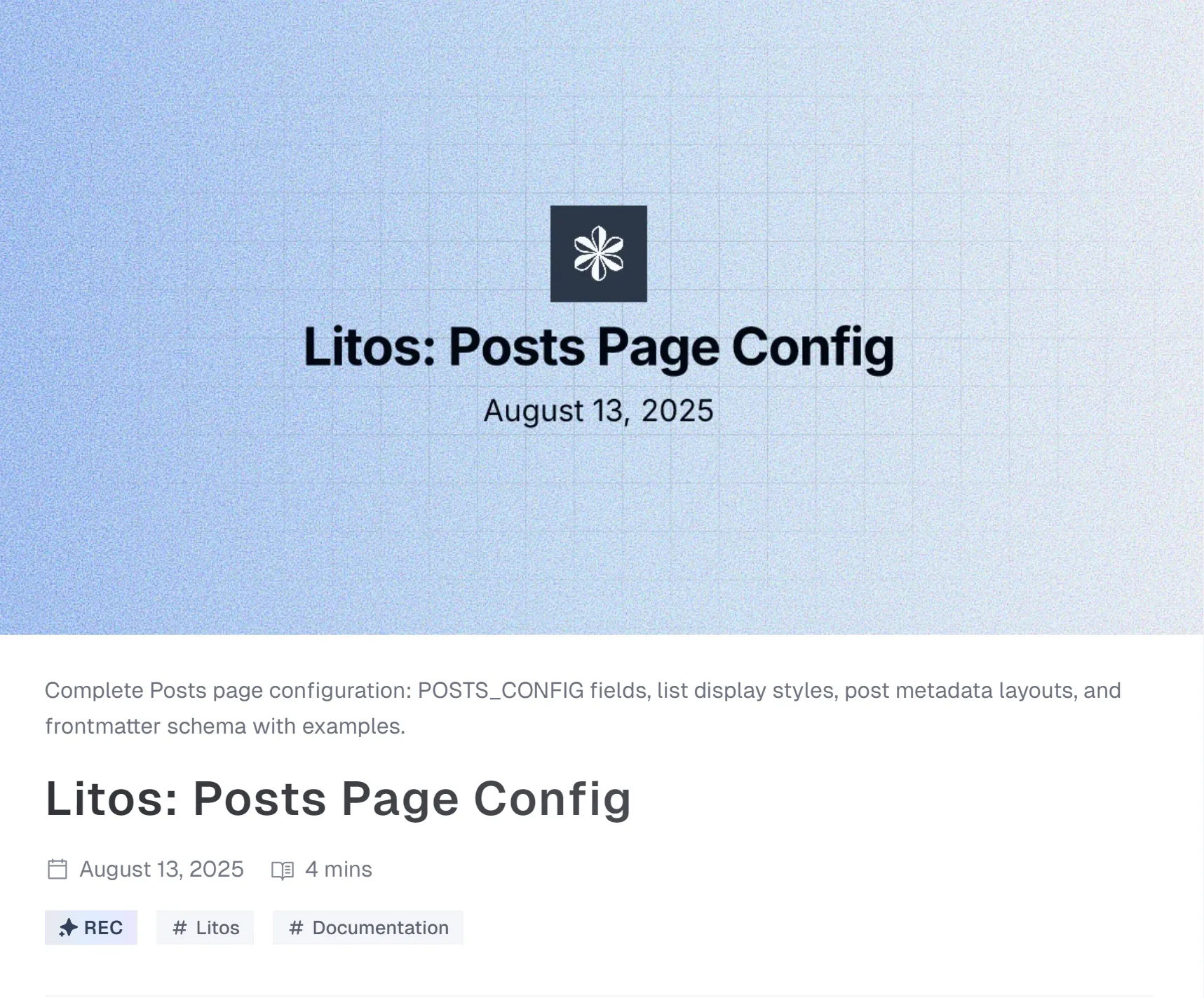
Posts Page Configh3
The posts page config is configured in the following code:
export const POSTS_CONFIG: PostConfig = { title: 'Posts', description: 'Posts by Marlon', introduce: 'Here, I will share the usage instructions for this theme to help you quickly use it.', author: 'Marlon', homePageConfig: { size: 3, type: 'compact', }, postPageConfig: { size: 10, type: 'minimal', }, tagsPageConfig: { size: 10, type: 'time-line', }, ogImageUseCover: false, postType: 'metaOnly', imageDarkenInDark: true, readMoreText: 'Read more', prevPageText: 'Previous', nextPageText: 'Next', tocText: 'On this page', backToPostsText: 'Back to Posts', nextPostText: 'Next Post', prevPostText: 'Previous Post', recommendText: 'REC',}There are a few configuration attributes, please refer to the table below for details.
| Property | Description |
|---|---|
| title | Title displayed on browser tags and title displayed on list pages. |
| description | The metadata description in the head element of the list page. |
| introduce | The introduce below the title on the list page. |
| author | The author of the posts. |
| homePageConfig | readme page configuration. |
| size | The number of posts displayed on the readme page. |
| type | In the read page, the style of displaying data in a list , compact 、minimal 、time-line or image. |
| coverLayout (optional) | When the type is image, this attribute can set the position of the image in the card. You can choose left or right. If not set, it will appear alternately on the left and right. |
| postPageConfig | Same as homePageConfig above, but size represents the base number of pages and is used for post pages. |
| tagsPageConfig | Same as homePageConfig above, but size represents the base number of pages and is used for tag pages. |
| ogImageUseCover | Whether to use the cover image as the Open Graph image. |
| postType | The default display component for the top metadata of the post’s specific content display page.You can configure metaOnly、 coverSplit、coverTop. Can be replaced by frontmatter settings for content. |
| imageDarkenInDark | Whether to darken the image in the dark mode. |
| readMoreText | The text of the read more button. |
| prevPageText | The text of the previous page button. |
| nextPageText | The text of the next page button. |
| tocText | Title text of the directory |
| backToPostsText | The text of the back to posts button. |
| nextPostText | The text of the next post button. |
| prevPostText | The text of the previous post button. |
| recommendText | The text of the recommend tag. |
Type & PostTypeh4
In the above document, we mentioned configurable types for configuring the display style of list data on the readme page, posts page, and tags page, as well as configurable postTypes for displaying metadata at the top of the posts content page.
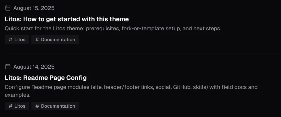
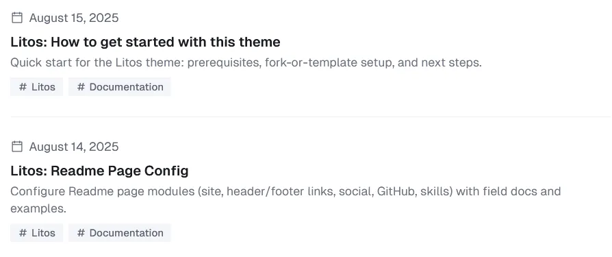
Here is the specific style display of type:
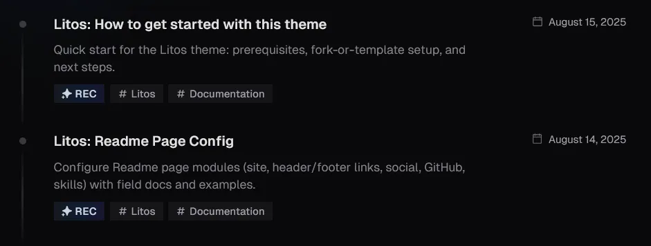
Here is the specific style display of postType:
Frontmatterh3
After discussing the external list and overall design of the post, let’s take a look at the content of the post together. These contents are all in the src/content/posts folder.
Below is the frontmatter of the post content:
---title: 'Marlon: Posts Page Config'description: ''pubDate: 2025-08-13author: 'Marlon'recommend: truetags: ['Marlon', 'Documentation']---You can configure the frontmatter of the post content in the following code:
const posts = defineCollection({ loader: glob({ pattern: '**/*.{md,mdx}', base: './src/content/posts', }), schema: ({ image }) => z .object({ title: z.string(), description: z.string(), pubDate: z.date(), tags: z.array(z.string()).optional(), updatedDate: z.date().optional(), author: z.string().default(POSTS_CONFIG.author), cover: image().optional(), ogImage: image().optional(), recommend: z.boolean().default(false), postType: z.custom<PostType>().optional(), coverLayout: z.custom<CoverLayout>().optional(), pinned: z.boolean().default(false), draft: z.boolean().default(false), }) .transform((data) => ({ ...data, ogImage: data.ogImage ? data.ogImage : POSTS_CONFIG.ogImageUseCover && data.cover ? data.cover : undefined, })),})| Property | Description |
|---|---|
| title | Title of the post. |
| description | Overview of the content of the post, also used for SEO. |
| pubDate | Post release date. |
| tags | List of tags for posts |
| updatedDate | Latest update date of the post. In the sorting of the post list, the priority value is greater than the publication date. |
| author | The author of the post. |
| cover | When the type of the list is image, the cover image used for display, or the cover image displayed at the top of the postType coverSplit or coverTop |
| ogImage | The Open Graph image of the post. |
| recommend | Whether to display the recommend tag. |
| postType | The display component for the top metadata of the post’s specific content display page. You can configure metaOnly、 coverSplit、coverTop |
| coverLayout | When the type is image, this attribute can set the position of the image in the card. You can choose left or right. If not set, it will appear alternately on the left and right. |
| pinned | Whether to top the post. |
| draft | Whether to hide the post. |
Regarding cover and ogImage.
Cover and ogImage are two independent attributes, and the only one that can connect them is POSTS_CONFIG.ogImageUseCover.
POSTS_CONFIG.ogImageUseCover is enabled by default, so you only need to write cover to configure ogImage at the same time. This applies to situations where the cover and ogImage are the same. If you want to customize ogImage, you can set it separately.
If POSTS_CONFIG.ogImageUseCover is not enabled, ogImage needs to be set separately. If you do not set it, the site’s ogImage will be used as a fallback.
POSTS_CONFIG.ogImageUseCover > cover
Syntax and Code Styleh3
This guide will show you how to format text using Markdown through a 3-day city trip itinerary. Learn Markdown while planning your journey!
Heading Levelsh4
For travel notes, multiple heading levels help organize days, time blocks, and tips:
# 3-Day City Trip Itinerary
## Day 1: Arrival & Old Town
### Morning Plan
#### Coffee Stops
##### Metro Tips
###### Notes
Text Formattingh4
When writing travel notes, highlight important info:
Must-see spots should be bold
Flexible time uses italics
Critical cautions can use both
Optional detours use strikethrough
**Must-see spots** should be bold_Flexible time_ uses italics**_Critical cautions_** can use both~~Optional detours~~ use strikethroughPacking List (Unordered List)h4
- Passport, visa
- Camera, extra battery
- Bring a fast charger
- Spare SD card
- Refillable water bottle
- Public transport card
- Passport, visa- Camera, extra battery - Bring a fast charger - Spare SD card- Refillable water bottle- Public transport cardDay 1 Schedule (Ordered List)h4
- Airport → hotel check-in
- Old Town walking tour
- Evening river cruise
- Arrive 15 min early
- Queue at Gate B
- Window seats recommended
1. Airport → hotel check-in2. Old Town walking tour3. Evening river cruise 1. Arrive 15 min early 2. Queue at Gate B 3. Window seats recommendedBlockquotesh4
Traveler tip: Buy a 24‑hour metro pass if you plan 3+ rides in a day.
Save the hotel address in offline maps for quick access.
> Traveler tip: Buy a 24‑hour metro pass if you plan 3+ rides in a day.>> Save the hotel address in offline maps for quick access.Code Blocksh4
Use simple code to estimate budget:
type Budget = { flight: number; hotel: number; meals: number; transport: number }export const total = (b: Budget) => b.flight + b.hotel + b.meals + b.transport
console.log(total({ flight: 1200, hotel: 450, meals: 180, transport: 60 })) // 1890Tablesh4
Sample schedule:
| Time | Place | Notes |
|---|---|---|
| 09:00 | Old Town Square | Guided walking tour |
| 12:30 | Riverside Cafe | Lunch + short rest |
| 18:00 | City Pier | Sunset cruise |
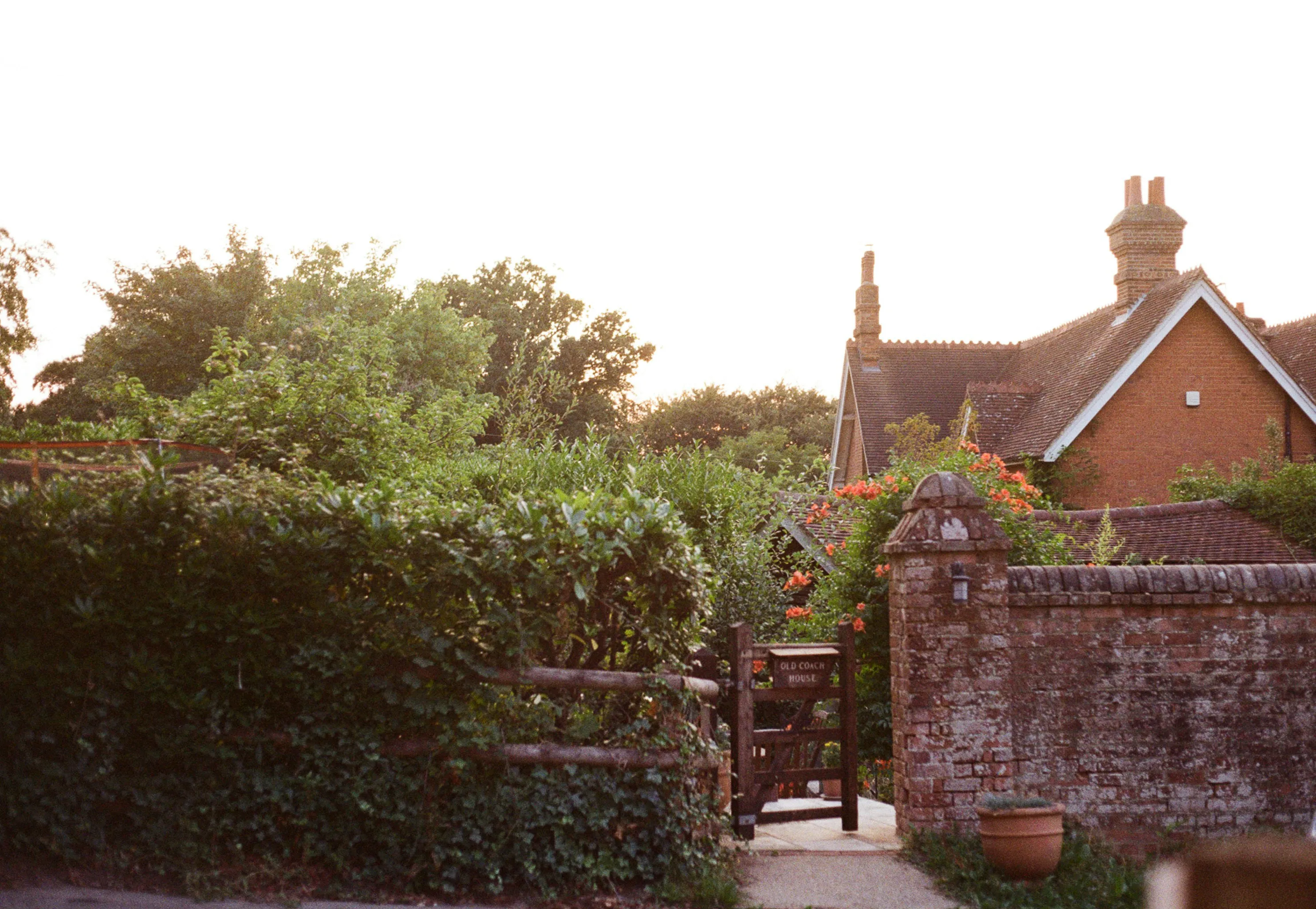
Links and Imagesh4
More tips: Official Tourism Board
Trip photo:
Horizontal Ruleh4
Inline Codeh4
Metro line A runs every 5-7 minutes during peak hours.
Math Formulash4
Daily budget estimation:
Total trip:
Task Listsh4
Pre-trip checklist:
- Book flights
- Reserve hotel
- Buy metro pass
- Download offline maps
Footnotesh4
This itinerary draws on local travel guides(click to the footnote) 1.
Expressive-code configh3
In Markdown documents, we use code blocks to display code snippets and other content. This document explains how to customize the code block configuration.
The code blocks in this theme are configured using Expressive Code with all configuration options defined in the ec.config.mjs file. Below is the main configuration options:
import { defineEcConfig } from 'astro-expressive-code'import { pluginCollapsibleSections } from '@expressive-code/plugin-collapsible-sections'import { pluginLineNumbers } from '@expressive-code/plugin-line-numbers'
export default defineEcConfig({  defaultLocale: 'zh-CN',  defaultProps: {    wrap: false,    collapseStyle: 'collapsible-auto',    showLineNumbers: false,    preserveIndent: true,  },  minSyntaxHighlightingColorContrast: 0,
  styleOverrides: {    uiFontFamily: 'GeistMono, Input Mono, Fira Code, ShangguSansSCVF, monospace',    uiFontSize: '1em',    codeFontFamily: 'GeistMono, Input Mono, Fira Code, ShangguSansSCVF, monospace',    codeFontSize: '14px',    codeLineHeight: '1.4',    borderRadius: '0',    codePaddingBlock: '0.8571429em',    codePaddingInline: '1.1428571em',    borderColor: ({ theme }) => (theme.type === 'dark' ? '#24273a' : '#e6e9ef'),
    frames: {      frameBoxShadowCssValue: false,      inlineButtonBackgroundActiveOpacity: '0.2',      inlineButtonBackgroundHoverOrFocusOpacity: '0.1',    },    textMarkers: {      backgroundOpacity: '0.2',      borderOpacity: '0.4',    },  },
  plugins: [    pluginCollapsibleSections({      defaultCollapsed: false,    }),    pluginLineNumbers(),  ],
  themes: ['catppuccin-macchiato', 'catppuccin-latte'],  themeCssSelector: (theme) => (theme.name === 'catppuccin-macchiato' ? '.dark' : ':root:not(.dark)'),  useDarkModeMediaQuery: false,  useStyleReset: false,})
You can go to the website to view the configuration options of expressive-code.
Footnotesh2
-
City Tourism Guide, 2024 Edition. (click back to the text) ↩